Showing posts with label inspiration. Show all posts

Friday, July 6, 2012

Keeping Cool in the Studio

We lost power for almost five days due to the big storm that ripped through Ohio and on to the east coast last Friday.  The hardest part for me was not being able to wake up and head into the studio as I’d been doing since my son finished school at the beginning of June.  I was really enjoying getting in there every day and making progress on things.

I have been painting a lot since taking the class with Carla Sonheim in April.

Today I finally got back upstairs.  And I was lost as to where to begin.

So I cut circles.

blog july 6 cutting circles

Of course I left my little Fiskars in the bag I packed to take with us to the church where we had shelter during the power outage, so I had to use these scissors.  That meant I couldn’t cut out the centers yet.

blog july 6 pile of circles

I kind of like how they look piled up here waiting for me to finish the cutting.  Nothing like cool blues and greens on a hot hot summer day (we’re looking at temps near 100F for the next several days).  It helps that the air conditioner blows at my art table too.

I’ve been taking every July for the past several years to work on personal projects.  This year July has sure gotten off to a weird start.

What have y’all been doing to stay cool?

Monday, February 13, 2012

Left Handed Complement

Lately I’ve been trying to shake up my art making habits.  I’ve not been letting myself go to my default time-killers, like knitting or mindless beadwork (as opposed to beaded imagery).  It’s been really difficult.  Some days I don’t do anything at all because I’m “not allowed” to go to those default activities.  I just feel that right now I really want to concentrate on one or two forms.  And I really miss drawing.  It’s my original voice, and it’s gotten buried underneath all the other layers of forms I’ve been visiting.

Last night I watched the Grammys, and as I watched, I decided to do something a little different.  I allowed myself to draw with my non-dominant hand.  In this case, my left hand.  I had fun and wasn’t worried about the outcome or making it perfect.  And as I drew I could feel the delight coming back.

left handed drawing one

This guy kind of reminds me of Max from Where the Wild Things Are. 

left handed drawing two

I think this is my favorite.  I had lots of fun drawing the suckers on the tentacles, and the little fish remind me of the submarines I drew for the Sketchbook Project two years ago.  I think I will be revisiting this image again.

left handed drawing three

By the third drawing I was starting to think about subject matter.  I thought this was going to be a bee, but she kind of morphed into someone sleeping in their cocoon.  I’m not sure what the dream is about.  I added the jar because it represents the container for her dreams.

left handed drawing four

This was drawn near the end of the show, when they were announcing the Song and Album of the Year.  I didn’t want to fill the whole sky with flowers and that is why I drew the big marquee.  It reminds me of the ending credits of the old Bullwinkle show.  You can see how tired the little bird is by the circles under his eyes.  It was a long night of fun.

Drawing this way really helped me loosen up and just enjoy the process.  I highly recommend it!

Wednesday, December 14, 2011

30 Days of Drawing: Day Fourteen

30 days day fourteen

I just love the handles on these old kitchen utensils.  From the top: potato masher, spatula and sieve.  Or as I call them , Papa Bear, Mama Bear and Baby Bear.  Image size 12” x 15”

30 days day fourteen detail

Detail.  I used mostly Prismacolor pencils, with a few Derwent Inktense and Graphitint pencils for the details.  The background is Grumbacher Acrylic in Payne’s Gray and Martha Stewart craft paint in Cloud, satin finish.

I promised a peek at the really big drawing. 

30 days days twelve thru

This is on Strathmore 400 series drawing paper, and measures approximately 60” x 36”.  I have to stand on a stool to reach the top of the drawing.  I’m using graphite sticks in 3B and 6B.  It started with just random marks but has evolved into this image.  The working title is “Eclipse”.

See you tomorrow!

Tuesday, December 13, 2011

30 Days of Drawing: Day Thirteen

30 days day thirteen

Today I chose to go a little larger and also on a white background.  It was more difficult to build up a good layer of color as the texture of this paper was very defined.  I also was challenged by recreating the metal of the beads and buttons on this necklace.  I’m pleased with how the turquoise bead turned out as well as the black bead in the lower right corner.  Overall the drawing worked for me.  I do think that I may pre-color the paper before attempting another drawing on it, at least if I go for another color drawing.

Monday, December 12, 2011

30 Days of Drawing: Day Twelve

Yes, I did draw on Friday, Saturday and Sunday (also known as Days Nine, Ten and Eleven)  I just haven’t scanned them yet.  I need to find a more effective way to draw over the weekends.

I picked up some darker red pencils on Friday (I had to take my daughter to the airport, and since we were near the art supply store anyway….), so this morning  I took them out for a test run.

30 days day twelve

I tried to avoid using the black pencil for the black beads.  I think it turned out well.  I enjoyed drawing the big cinnabar bead on the upper right. 

30 days day twelve b

Another red handle.  Eventually I will draw the entire tool, but for right now I am enjoying the weathered look of these old utensils.

Something else is literally on the drawing board, I will post pictures of it when I post days 9, 10 and 11.  Stay tuned!

Thursday, December 8, 2011

30 Days of Drawing, Day Eight: Draw Hard

When I was little, my grandpa worked at the General Motors Tech Center.  He would bring home tons of Prismacolor pencils for me to play with.  I think he’d be pleased to see that I am still drawing all these years later.

Today I finally got back into the studio for a little while, so I went a little hog wild.

30 days day eight a

You might recognize this necklace from the past two days of pencil and pen and ink drawings.  The bone beads with the incised detail were a pain, but I’m overall pleased with how they turned out.  I really love the lampwork beads and the detail in them.

30 days day eight b

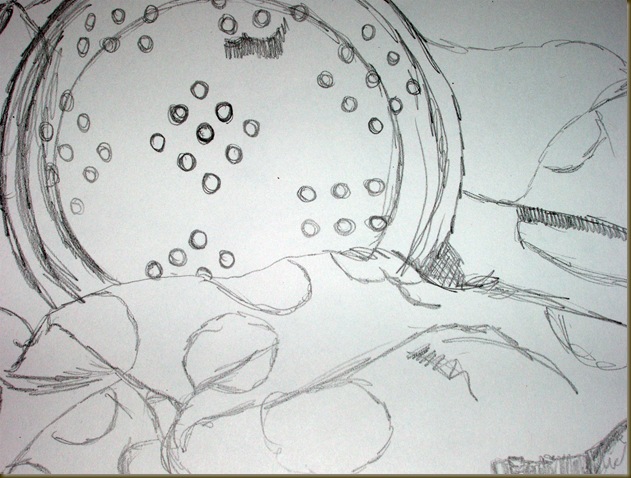
I wasn’t ready to go back downstairs, so I did another drawing, this time based on a small sieve my friend picked up for me at a yard sale.  I just love old tools.  I wanted to detail the handle of the piece.

drawing red one

Here’s a different version of the same tool, from a large drawing I was working on last month.

I’m not sure what tomorrow is going to bring, but I know it will be fun!  There’s still time to play along, head over to Traci’s journal and add your name to the caravan.

Thursday, June 23, 2011

What I Did On My Summer Vacation

Every summer since my oldest daughter finished kindergarten, I have tried to have some sort of fun departure from normal creative activities around Chez Stern.  One year we tie dyed t-shirts, another we attempted papier mache.  A few years ago I declared July a month of silence, with no TV during the day, except to watch the occasional DVD from Netflix (I rented the series of films by Ray and Charles Eames that summer, so much fun).  We always enter August refreshed and ready to get back to our regularly scheduled program, albeit with a new twist from what we’ve learned.

This summer I am working with four books.  Mess by Keri Smith, Learning by Heart by Corita Kent and Jan Steward, The Confident Creative by Cat Bennett  and Rip the Page! by Karen Benke

One of the exercises mentioned in Learning by Heart is to make 100 drawings of something, I believe it was a weekend exercise.  With that in mind, and inspired by going through my work for the three shows I am currently exhibiting in, I set myself an assignment.

This is the first still life I set up:

100 drawings still life two_picnik

The enamel ladle is from Marty’s Grandma Rita, the towel is an old Martha Stewart towel from KMart, and the bulbs are used Print Gocco bulbs that I loved and couldn’t throw away.

100 drawings drawing one_picnik

All the drawings are on 11 x 17 white drawing paper from Crafts 2000.  For these four I used a Derwent 2B drawing pencil.

100 drawings drawing one detail two_picnik

Detail.

100 drawings drawing one detail three_picnik

Detail.  You can see where I started to shade in the ladle.  I haven’t yet decided how detailed I want these renderings to be.

100 drawings drawing two_picnik

For the next three drawings I chose to focus more on the lightbulbs.  As I drew, I worked on noticing small details, like how I could see myself reflected in the bulbs.

100 drawings drawing two detail_picnik

You can see the different ways I chose to express the shadow in this detail.

100 drawings drawing three_picnik

Drawing three, emphasis on one bulb.

100 drawings drawing four_picnik

Drawing four, the minimalist approach. 

Having done these three drawings yesterday afternoon, I can see the appeal of rendering something repeatedly, as I did notice more detail as I went along.  I also am thinking of the various ways I could do the drawings, not all of them need be realistic, of course, and I can use different drawing materials to work with.  I decided to take a break after this piece and start fresh the next day.  This is going to be an interesting challenge.

Monday, April 25, 2011

One Part Inspiration

Thomas Edison once said “Genius is one part inspiration, ninety nine percent perspiration.”  Which means, of course, that ideas are plenty, but what actually is important is that one spends time actually working to see the idea come to fruition.

I have shared my journals and process in the past , as well as written about some of my inspirations.  Today I am going to share what I am working with right now.

On my birthday, I was gifted with a book about the life and art of the textile designer Vera.  I had read an article about her in American Artist magazine when I was a teenager and have been inspired by her work ever since.  That same day we also visited the Franklin Park Conservatory, and I took nearly one hundred pictures of the plants and wildlife on exhibit that day.

Here are a few of the images from that trip:

20040101_62

20040101_68

I loved the red and green striping in this plant, and see several pattern possibilities in the structure.


20040101_96

This piece is crying out to be rendered as an abstract stitching to explore the different textures and colors.

20040101_25

This may end up being a knit piece.  Or perhaps a machine embroidered piece with individually embroidered petals.

20040101_42

I love this tree with all the different eyes.  The fringy bark just puts it over the top.  So many ideas, cannot pick!

With these photos in mind, I made a few sketches in my Moleskine, and translated one of them into fabric.

veras conservatory

Vera’s Conservatory, 2011  18” X 24”  Hand dyed cottons from my friend Diane Eyerman’s collection, commercial batiks and commercial cottons.  Machine appliqued and machine quilted.

veras conservatory detailone_picnik

Detail of the tree bark.

veras conservatory detail two_picnik

Detail of the machine quilting. 

I really enjoyed translating my experience at the Conservatory that day into a piece of wall art.  I already have plans for more pieces based on the images I took.  Lots of inspiration, now it’s time for the perspiration! :D

Monday, March 21, 2011

A Little Respite on the Journey


Sometimes it is necessary to take a day or two to replenish the well.  Lately I’ve been feeling burned out to the point of just wanting to stay in bed some mornings.  That’s not an option, and I know it wouldn’t help in the long run (I tend to get down on myself for indulging in such non-productive behavior), but sometimes it is ok to take a day to play with something I love to do.  Yesterday, it was drawing with my beloved Caran D’Ache Neocolor II water soluble crayons.

drawing march 2011 four

Since the point of this activity was to have fun, I didn’t sweat setting up a large still life or anything complex.  Instead I went to my jewelry collection, and drew one of my favorite necklaces. I chose to focus in on one of the floral beads and the wonderful little coral pieces.  Since I am using a smaller drawing pad (Strathmore Artagain black, size 6” x 9”), this filled the space quite nicely.

drawing march 2011 two

Last spring I purchased this happy little bluebird at a local nursery, and today he made a nice subject for a second drawing.  I love the contrast of the bright blue against the sunny orange.

drawing march 2011 three

I actually drew this picture a few weeks ago.  I was inspired by my bird of paradise work, and wanted to do something similar with another flower.  A trip to a local florist yielded this beautiful iris.  And yes, it is in process as a stitched image. 

I really enjoy working this way, and have a few more drawings planned.  And tomorrow I will return to the studio refreshed and ready to get back to work.

What do you do when you need to recharge?

Monday, March 14, 2011

Wasted Time

I was chatting with a client a few weeks ago, and she was telling me how discouraged she was by looking at the pile of small works that she had lying in her studio.  She referred to the time she had spent making them as “wasted”, and I could tell this bothered her very much.

I pointed out that she had learned valuable lessons from making the small works, and that time spent in creating is never truly “wasted”.  It’s really in how we choose to look at it. 

My own studio is full of piles of wasted time, in the sense that it is either incomplete, is not in a style which I normally work, or is work which has been exhibited, but which has come home from the exhibit rather than going onto a new home (ie sold).   And, yes, sometimes I can become discouraged as well. 

This is where reframing can come in handy.  Instead of looking at all these various works as wasted time (in my case I think of wasted time as time not spent working toward my larger goal, which at the time of creating these pieces was to make large, award-winning works, which toured in prestigious shows and went to new homes at the end of the shows), it helps to remember these things:

False starts or diversions (“wasted time”):

  • Allowed me to try a new way of working (how can I know if I will like something unless I try it out?)
  • Helped me to find out what I do like (hand stitching and machine embroidery, most definitely, fusing lots of different elements to a base background, not so much)
  • Allowed me to experiment with presentation (sew a piece to a canvas? use a different model than the sleeve/rod one which most quilt shows use? and then how does one exhibit a three dimensional work, such as a knitted hat or a found object sculpture?)
  • Helped me to hone my skills.  Work which isn’t “important” can have mistakes, which is incredibly freeing.  When you’re not worried about whether the piece is award winning, you can play.  Play is very important in my process.
  • Helped to keep me in the creative flow.  If I was between projects, I still had something going on, rather than returning to mindlessly surfing the internet or watching Days of Our Lives again.
  • Allowed me to try a new media, a new style or a new way of thinking about my work.  The time I spent knitting my hats led to different ways of thinking about color and texture in my quilts, for example, and also helped me to understand how to better create my beaded sculptures.
  • Sparked ideas for the “real work”.  Color combinations, perhaps a subject, or simply the fact of giving myself a brain break is often enough to enable me to get back to my larger pieces.

And then, over time, as the wasted time piles up, you may realize that these pieces do belong in your larger body of work, because they have helped you to develop your voice and find what is important to you.

Nothing is ever really wasted.  It’s all in how you think about it.

My client was very happy to hear this, and I hope you are too.  Use those false starts and experiments as jumping off points for something new.  Amaze yourself.  I know you can do it.

If you liked this, sign up for my newsletter and receive a fuller version of Reframing Wasted Time; I promise to never sell or give away your information.  Thank you!

Tuesday, March 8, 2011

Miss Scarlet’s School of Patternless Sewing


Video trailer for Kathy Cano Murillo’s newest novel Miss Scarlet's School of Patternless Sewing

Kathy Cano Murillo, The Crafty Chica, has long been an inspiration to me, and many of us in the crafting community.  Her joyous can do spirit shines through everything she does, and I  love reading her tales of her crafty adventures.  It was only natural that she also turn her gift with words to ficition, and it was with great delight that I read her first novel Waking Up in the Land of Glitter when it was released last spring.   That story of friendship and crafting was so vivid and so inspirational that I was eager to read her second novel.

Miss Scarlet’s School of Patternless Sewing also tells the tale of a group of women, and the friendships formed around a common goal.  Scarlet Santana is a young designer who worships the designer Daisy de la Flora, and who writes a crafty blog dedicated to Daisy and her style, both in creating artwork and creating a life.  When Scarlet wins an opportunity to study with Daisy’s nephew, the well-known Johnny Scissors, she decides to teach a class in her signature patternless sewing style to raise the funds for the trip to New York City.

The women Scarlet meets in her class range from the high school students Stephanie and Jennifer, to young career-minded wife and mother Mary Theresa, to life-changing Olivia (pronounced “Oh Live Yah!”) and the mysterious Rosa.  Through the course of the class the women get to know each other and bond over their individual dreams and hopes.  They provide each other support and a cheering section for when things get overwhelming.  None of the women are the same at the end of the story as they were at the beginning, and all of them find that dreams don’t die, even when it appears all is lost.

I really enjoyed this novel, the depth of detail Kathy uses in describing each setting and character satisfies my desire for feeling like I’m part of the story.  Scarlet’s style, the design work of Daisy, the setting of Vega’s Vicious Vinyl and of course Nana Eleanor’s home all feel like real places.  Kathy also manages to  fit a lot of her “you can do this too” enthusiasm in through the use of blog posts written by Miss Scarlet, that have tips and techniques for living a fuller, more rich life.  Inspirational and entertaining, Miss Scarlet’s school is a place I would love to visit over and over again

MissScarlet-416x143

As part of the blog tour for Miss Scarlet’s School of Patternless Sewing, I am pleased to present this post from Kathy herself.  As someone who admires Kathy’s ability to transition from the world of making visual art to the world of creating with words, I asked how she handles this sometimes challenging shift in creating, and how each medium can feed the other. This was her answer:

“They both are about translating imagination, but in different forms. I draw from the same pool of creativity – choosing a color story, the mood, a message and then creating a background and foundation, the focal point and the accents and embellishments. Often, while I’m working in the art room, I’ll listen to music that my characters like and think about their storylines. And when I finish a project, it feels good to switch over to writing, I’m excited and ready to type away! I love that with writing, there is no mess. However,  it’s much more difficult to redo a 90,000 manuscript that it is to make changes to an art piece!”

To celebrate the release of Miss Scarlet’s School of Patternless Sewing, I am hosting a giveaway of Kathy’s novels.  One lucky winner will receive a copy of each novel, Waking Up in the Land of Glitter and Miss Scarlet’s School of Patternless Sewing.  Just leave a comment below, and answer the question, what is your favorite craft supply?  I will pick the winners on Monday, March 14.

Monday, February 28, 2011

From Start to Finish

Sometimes art takes a long time to be created.  I drew this bird of paradise twenty years ago while finishing my undergraduate degree.  It is soft pastel on Mi-Tientes paper.  I still can remember the piles of pastel dust that formed on the easel as I worked.  Having a toddler at the time, I was concerned about her safety, and so the pastels went away.

bird of paradise drawing one

Two months ago, while cleaning in the studio, I came across the original drawing, as well as some photographs I’d taken of it at the time.  Since I’ve been working with machine embroidery on photo transfer, I decided to revisit the image.

20040101_21 

I printed out the picture onto Avery transfer paper, after flipping it in my paint program so that it was a mirror image.  I ironed it onto some white twill that I got at Dharma Trading Company, and backed that with several sheets of interfacing designed for machine embroidery.  Here you can see the piece in process.

bird of paradise embroidery 1

The piece, stitching complete.

 bird of paradise I detail two

A detail of the stitching.  You really can see the bird in the flower in this segment. 

I chose to finish this piece differently than the small water tower pieces, and chose some fabric from my stash to sew borders onto the piece.  Then  I stretched that over a 12” x 14” pre-stretched canvas I bought at Dick Blick.  I preferred to use a pre-stretched canvas because the fabric on the piece would be protected from any acids in the stretcher bars.  If I used plain stretcher bars I would seal them first.

 bird of paradise I

The finished piece, available in my Etsy shop

I once told a friend that time is never wasted making something we love.  This certainly was true for this piece.  Even though I never exhibited the original, it still makes me happy to see it and has inspired several pieces over the years.

Wednesday, February 23, 2011

Tutorial : Our (Green)House

Last year I made a set of house collages using materials at hand rather than going out and buying new supplies.  Granted, I spent many of the years between 2000-2006 making many “Mr. Toad” (wild ride) trips to Columbus to acquire supplies, so my studio is as well stocked as a small art supply store, but I didn’t look any further than the recycling bin for the base of this project.  (One admission: the frames and spray adhesive needed to be purchased new, and I had to make color copies of my family photos to do this project).

To make your own house collage, you will need:

1 cereal box, emptied and flattened

Gesso and acrylic paint (the $0.89 bottles work just as well as the fancy art store brands for this project)

Paint brushes, water cups, rags for cleanup, putty knife

Template (see sidebar or download the house template here)

XActo, or other craft knife

Scrapbook paper, preferably solid or tone on tone (12” x 12” sheet, plus smaller pieces of other paper, or pre-paint your own paper )

Color copies of family photos, landscapes, whatever catches your eye.  You can also get some great images for collage at ArtChix Studio .

Found objects (I’ve used things like bottle caps, doily pieces, embroidered appliques and small rubber animals)

Acrylic gel medium

Rubber stamps, stencils, bubble wrap, sequin waste, anything that will make a repeating pattern on your base

Dollar store picture frame (with glass) approximately 8” x 10”

Spray adhesive

Pencil or other marking tool, masking tape

1.  First, paint your flattened cereal box with the gesso, letting each side dry completely before adding the first coat of paint.  Let each layer dry, adding texture and details using rubber stamps, stencils, or sequin waste.  I paint both sides on my cereal boxes, using different colors on each side so I have more choices when creating my design.  Waiting for the pieces to dry takes patience, but end result of the funky layers makes the process worth it.  Don’t worry if some of the original cereal box ends up showing through, that just contributes to the charm of the project (or maybe the Lucky Charm; sorry, couldn’t resist).

house collage paint and embellish

2. When you are happy with the way your cereal box looks, trace the house template onto it, and cut out, using the craft knife or a sturdy pair of scissors.

3.  Cut a smaller triangle out of the opposite color/side of the cereal box, and place in the gable, for contrast.

house collage choosing elements

Here you can see the various images I could choose from.  I love making copies of old artwork and resizing the image to fit these little collages.  It really expands my options.

4.  Choose your images and arrange them onto the house.  When you get an arrangement that pleases you, glue the components down using the acrylic medium.  I press larger pieces down using a heavy object such as a big jar of acrylic medium or fabric paint.  Let dry.

house collage arranging elements

Here I chose a piece of paper I had painted last summer using a fish design that I turned into a silkscreen.

house collage gluing the elements

Gluing the elements using the gel medium and the putty knife.

house collage with embellishments

I found some commercial embroidered appliques to add to the image.  I really like how it appears that my daughter is studying her garden.

5. Measure the inside perimeter of your picture frame.  Cut a piece from the 12” x 12” scrapbook paper to fit the area.  Don’t worry if it’s a little larger than your measurement.  It’s easier to trim excess paper than make a piece that is too small fit correctly.

6. Mask off the frame using the masking tape.  Clean the glass in the frame and let dry.  Then spray the glass with the adhesive and stick  the scrapbook paper in place, using a bone folder or old gift card to smooth out any bubbles.  If there is too much paper, try sliding the excess under the edges of the frame with the gift card, then trim any leftover.  Let dry.

7.  Using a putty knife, slather the back of the house with a layer of gel medium (I use  Golden’s Extra Heavy Gel on my pieces.  It’s very thick and stays where I put it).  You will have some ooze, so put a lighter coat near the edges than in the middle.

8.  Place the house, gel side down, centered on the scrapbook paper in the picture frame.  Weigh down with heavy jars as needed.  Let dry.

house collage pressing the collage


9. Remove weights and voila!  Hang your beautiful collage in its new home.

house collage on the frame too

This is a great way to make a simple piece of artwork for your home or office.  Use copies of pecial photos and give as gifts.  The possibilities are endless.  To see some of the work I’ve made using this method, look at my Etsy shop.  Have fun!

Sunday, February 13, 2011

One of My Favorite Days and People

I can’t remember ever not liking February.  Probably because it is so short.  February has the best birthstone (amethyst) and of course there’s Valentine’s Day, with the pink and red and lace and chocolate and hearts!

This year I made some of my own valentines to give out:

valentines in color one

FInished valentines made with Portfolio Oil Pastels on a base of painted, silkscreened and stenciled oaktag.  The drawings were made with India ink.

valentines detail one

A detail of what the blank cards looked like.  You can really see the detail of the silkscreen in this shot.  One of these days I will figure out how to make an image of the wonderful paint scribblings left on my art table.

valentines two

A whole batch of the cards awaiting decorating.

Many of my favorite people were born in February as well.  (With lots of birthday parties and cake! Cake and chocolate, yay!).  My most favorite February person is my Grandpa, who was born today (February 14).  He was a designer at General Motors, and would bring home lunchboxes full of the Prismacolor pencils he used at his job for us to play with. 

grandpa in fishing hat

He also had a good sense of humor.  When he retired, he decided to let his beard grow, and told me he was going to let it grow long enough to tie around his head.

grandpa and shep reading the paper

He also loved his dogs.  Here he is at our house in Michigan, reading the paper with Shep on the sofa next to him and our dog Laddie at his feet.

And my Grandpa loved me so much that when I fell in love with the treasure chest he’d made for himself, he made me one as well.

grandpas treasure chest one

I took this photo when I was 19 and in my “arty photo” phase.  :)  My Grandpa gave me his love of art and his fun sense of humor, and yes, occasionally his gruff demeanor.  Today would’ve been his 110th birthday.

Sometimes the best gifts are the intangible ones, though I wouldn’t trade anything for my treasure chest.  What gifts have your loved ones given you?